logo
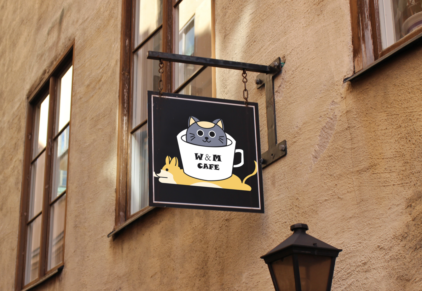
Visual strategies outlining design principles used: Visually I still used a comic hand-drawn style and I decided to use the comic forms of the cat and dog as the main visual elements. In the beginning, the kitten scratching out of the teacup swings from side to side, accompanied by the wagging of the puppy’s tail in the lower right corner of the cup. This is followed by the kitten peeking out of the cup and the dog jumping out of the bottom of the cup. The overall style is witty and cute.
The use of visual symbols is the best way to communicate a storyline when there is little written or spoken language. So, kittens waving their paws and poking their heads out, and puppies wagging their tails and jumping out vividly portray the image of pets in people’s minds as beautiful and lovable.
poster
In the design of the poster, I still used the comic hand-drawn style. In the space, I have chosen to place the human in the centre of the picture, and around the human, there are a number of small animals. I have repeated the graphics and colours of the cats and dogs in such a way that the viewer’s eye moves with the elements of the design and visually perceives them as a whole, subconsciously drawing lines between them. In the background, I have used three large blocks of colour to make the central figure and animal the focal point of the visual. And at the top, I added the name of the café, W&M, which is immediately recognisable and clearly visible to the viewer from a certain distance in an instant. And in the margins, I added a number of coffee bean patterns. The whole image emphasises an atmosphere where people and dogs and cats live together in harmony and enjoy the space. In terms of colour, I boldly used various clashing colours to make the picture look very rich and lively, in line with the image of small animals in people’s minds.
merchandise
The pattern can be applied to boxes, tags, bags, and other items. I thought this style of hand-drawn sketches would draw customers closer, less refined, with a hint of casualness, allowing them to let go of their tiredness and warming their hearts. I used repetitive elements and arranged puppies and kittens randomly in the space, with sleeping dogs and fat cats appearing in different forms. And adding the element of coffee beans and the name of the store at the edge, so that customers can understand at a glance – this is a cat and dog cafe.


